UI / UX Design
SBI Bank Landing Page | Revamp
State Bank of India serves millions of users daily, but its website experience feels dated, cluttered, and hard to navigate especially for first-time and digital-first users. This project explores how SBI’s digital presence can be modernized without losing the trust, credibility, and seriousness expected from a national bank.
Year :
2025
Industry :
Banking
Client :
Task
Project Duration :
3 days
Problem :
Overloaded homepage with too many banners and competing messages
Weak visual hierarchy, making it hard for users to identify what to do next
Inconsistent spacing, typography, and color usage
Website feels functional but not reassuring or modern
For a bank of SBI’s scale, the experience should feel clear, secure, and confidently modern not overwhelming.

Solution :
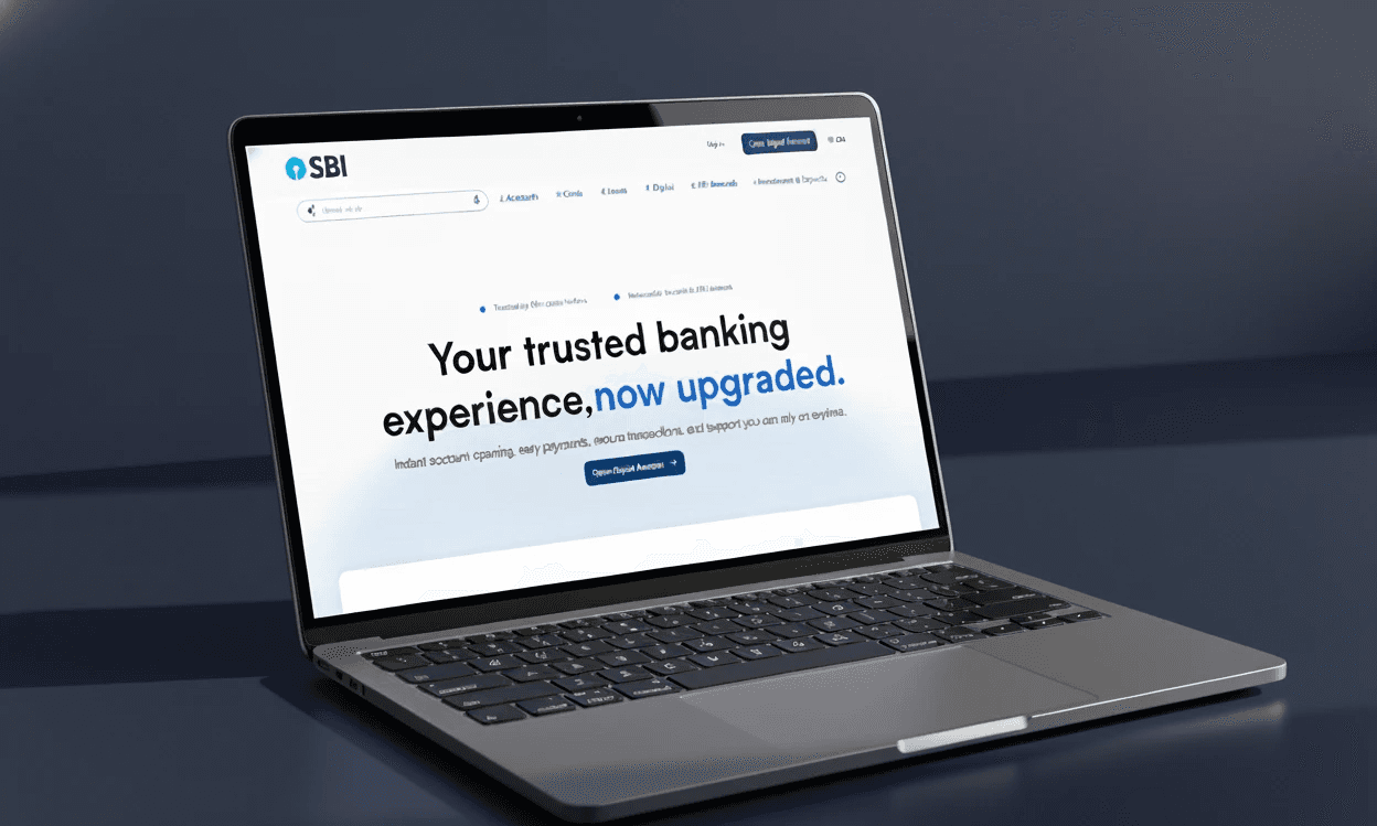
Defined a clear primary action (Open Digital Account) with strong visual focus
Simplified the homepage flow by separating hero messaging and promotional content
Designed a clean, light-mode interface using SBI’s core blue tones
Used modern typography and spacing to improve readability and trust
Reimagined banners and service sections with a more premium, structured layout
The redesign balances trust + modernity, keeping the SBI identity intact while making the experience easier and more welcoming.

View the Design:
More Projects


UI / UX Design
SBI Bank Landing Page | Revamp
State Bank of India serves millions of users daily, but its website experience feels dated, cluttered, and hard to navigate especially for first-time and digital-first users. This project explores how SBI’s digital presence can be modernized without losing the trust, credibility, and seriousness expected from a national bank.
Year :
2025
Industry :
Banking
Client :
Task
Project Duration :
3 days
Problem :
Overloaded homepage with too many banners and competing messages
Weak visual hierarchy, making it hard for users to identify what to do next
Inconsistent spacing, typography, and color usage
Website feels functional but not reassuring or modern
For a bank of SBI’s scale, the experience should feel clear, secure, and confidently modern not overwhelming.
Solution :
Defined a clear primary action (Open Digital Account) with strong visual focus
Simplified the homepage flow by separating hero messaging and promotional content
Designed a clean, light-mode interface using SBI’s core blue tones
Used modern typography and spacing to improve readability and trust
Reimagined banners and service sections with a more premium, structured layout
The redesign balances trust + modernity, keeping the SBI identity intact while making the experience easier and more welcoming.
View the Design:
More Projects
UI / UX Design
SBI Bank Landing Page | Revamp
State Bank of India serves millions of users daily, but its website experience feels dated, cluttered, and hard to navigate especially for first-time and digital-first users. This project explores how SBI’s digital presence can be modernized without losing the trust, credibility, and seriousness expected from a national bank.
Year :
2025
Industry :
Banking
Client :
Task
Project Duration :
3 days
Problem :
Overloaded homepage with too many banners and competing messages
Weak visual hierarchy, making it hard for users to identify what to do next
Inconsistent spacing, typography, and color usage
Website feels functional but not reassuring or modern
For a bank of SBI’s scale, the experience should feel clear, secure, and confidently modern not overwhelming.
Solution :
Defined a clear primary action (Open Digital Account) with strong visual focus
Simplified the homepage flow by separating hero messaging and promotional content
Designed a clean, light-mode interface using SBI’s core blue tones
Used modern typography and spacing to improve readability and trust
Reimagined banners and service sections with a more premium, structured layout
The redesign balances trust + modernity, keeping the SBI identity intact while making the experience easier and more welcoming.